Design
·
5 min read
Designing mobile-first experiences people love.
Rosald Smith
More than 70% of our clients’ traffic is on phones. Here’s how we design for thumbs first.
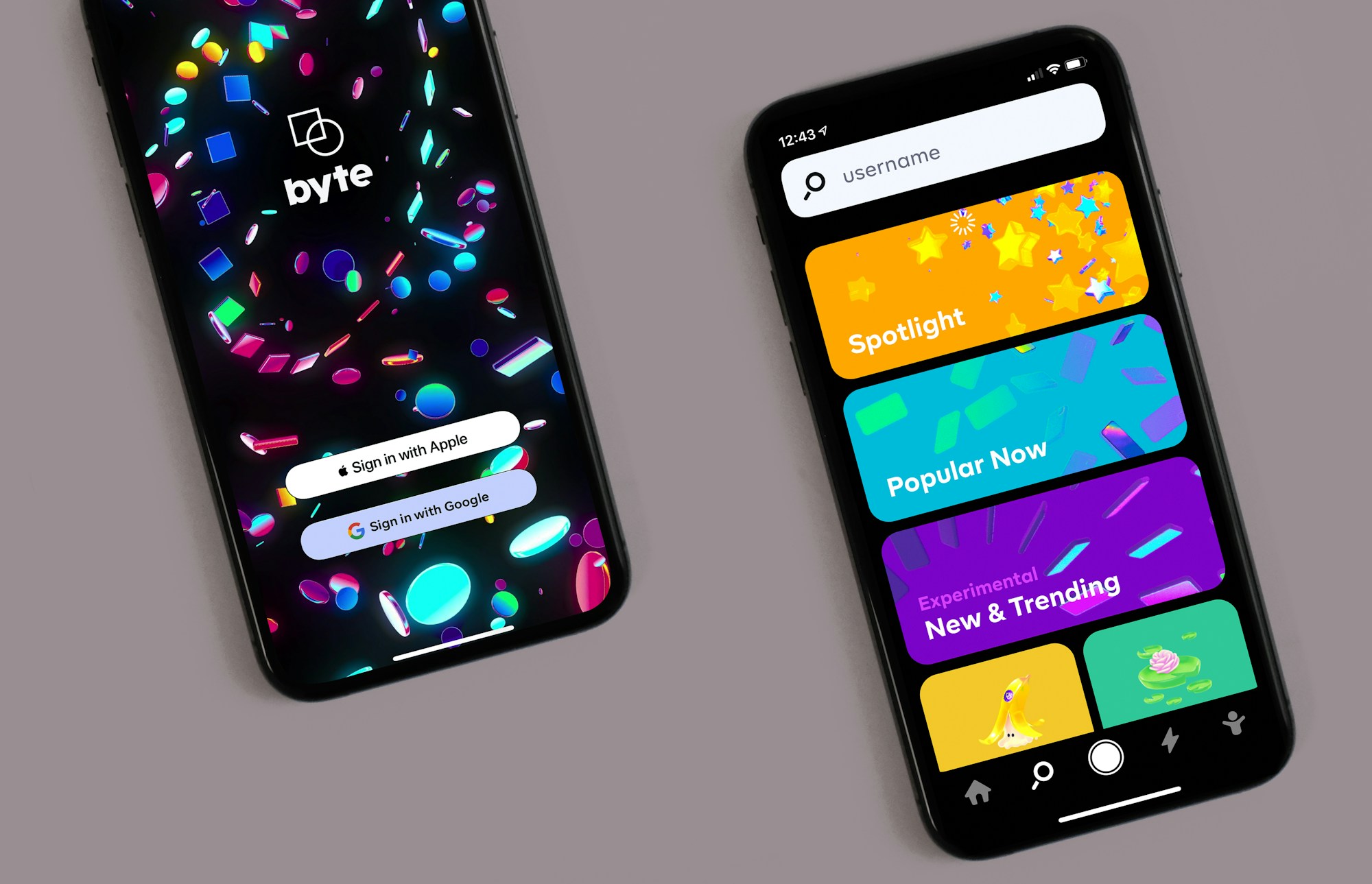
Designing for small screens forces you to prioritise. That discipline makes the desktop experience better too.
Thumb zones matter
Primary actions live in the lower half of the screen, where thumbs naturally rest. Navigation stays simple and predictable.
Content before chrome
On a phone, every pixel of UI competes with content. We keep headers slim and let the message breathe.
“Mobile-first isn’t a breakpoint. It’s a mindset.”
Scale up, not down
Once the mobile layout works, we expand into tablet and desktop — adding space and detail rather than cramming things in.


